- Advertising
Don’t Rebrand — Redesign! Here’s how to choose an ad-friendly theme
•
How does your site design affect your Mediavine ads?
For the most part, we can work with almost any theme. But here are a few designer tips for choosing a theme that will be both beautiful AND earn you all the $$$:
A sidebar
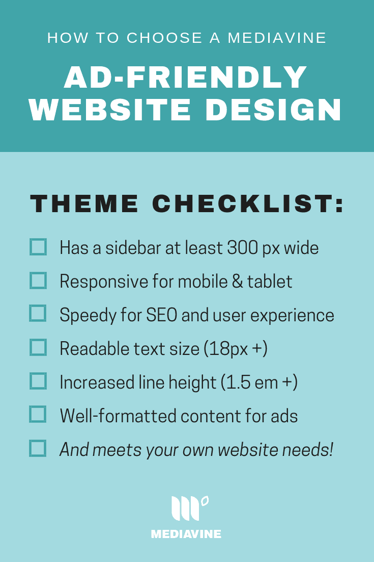
Most sites get a lot more mobile traffic than desktop these days, but the desktop traffic still plays a key role in your overall traffic and ad revenue. Advertisers tend to spend more on desktop readers, because they are engaged. Plus, there’s no sidebar on mobile, so the addition of this content area provides more ‘real estate’ for ads. Our sticky sidebar ad stays in view as a reader scrolls, and refreshes every 30 seconds with premium content, so that ad will keep earning for you the longer a reader stays on a page of your site. Our ads need a sidebar that’s at least 300 px wide. It’s important that the sidebar doesn’t shrink to smaller than that when the browser window size is adjusted. If you choose a design without a sidebar, we can still work with you, but it can affect your earning potential with readers on desktop. We also recommend a short sidebar, in terms of how much content you include, because of that sticky quality. The sooner the ad comes into view, the sooner it can start earning for you. Use a heat map plugin to help you determine how your users are using your sidebar, and make changes based on what you learn.Responsive design
Because most readers are on mobile these days, it’s very important to have a site that is mobile responsive. This is key for SEO too, as Google cares about user experience and whether mobile readers can get the most out of your site. Take Google’s Mobile-Friendly Test to test how easy it is for a visitor to use your page on a mobile device. There are some solutions out there, like WP Touch, that can force a mobile site, but it’s best if your theme has one automatically.
Site speed
A new theme can absolutely affect your site speed scores, which can ultimately affect your ad revenue. They might have image elements that aren’t optimized, or maybe they have a built-in feature (such as lazy loading or a post builder) that doesn’t monetize well. Before you change themes, be sure to run through your site through Google Page Speed Insights and make note of your mobile and desktop scores. Once you’ve made the switch, check your scores again to make sure they’re not crazy off. You can implement a tool like Short Pixel to help you optimize your images, and tackle some of the other line items by following these tips. We also recommend working on a plugin self-audit to make sure you aren’t running any extraneous plugins on your site.Font size
Remember high school? And how easy it was to get your paper a little closer to five pages just by setting your type to 12.5-point type instead of 12-point? Same rule applies here. Because of our in-content logic, your font size can absolutely affect your ability to earn with in-content ads. Increasing your font size or line height by even just 1-2 pixels can make a difference in how long your post is, improve in-content ad placement and the health of your sticky sidebar ad. We recommend setting your font size to 18px.Line height
Similarly to font size, your site’s line height — or the space between the lines of text — can also help lengthen your content and increase your ad earnings. We recommend setting your line height to 1.5 em.
The gist?
When choosing a theme for your site, the main things to consider are- a sidebar that’s at least 300 pixels wide, and doesn’t shrink to smaller than that,
- a speedy, responsive design that includes a great mobile view,
- and that your content itself is formatted in a way that is ad-friendly.
About the author
Share this page