Adding Subscribe Links to Fixed Header Navigation: Does it Work?


If you browse the Internet (if you don’t, you should try it sometime … also, welcome to Earth), you’ve probably seen a “Subscribe” link at the top of many websites.
While some news and magazine publications use these links to sell subscriptions, even more publishers utilize them as a tool for growing their mailing lists.
When we see a big trend like this, our job is to ask why. Are publishers doing this because it actually works? Or just due to FOMO and other websites doing it?
Well, we’re here to answer that, because we love data — and testing potential new features on our own sites, such as Food Fanatic.
So what did we learn when we added a Subscribe link to the fixed header navigation on one of the sites Mediavine owns?
As part of the Grow Power Pack, we recently introduced Click to Subscribe — a cool new feature that allows publishers to trigger a Subscribe modal or pop-up from any link or button on your page.

We’ve seen creative, in-content uses of this with Gutenberg blocks, as well as in recipe cards and sidebar widgets, but for this test case, we used it to trigger a Subscribe box when users click “Subscribe” in the header.
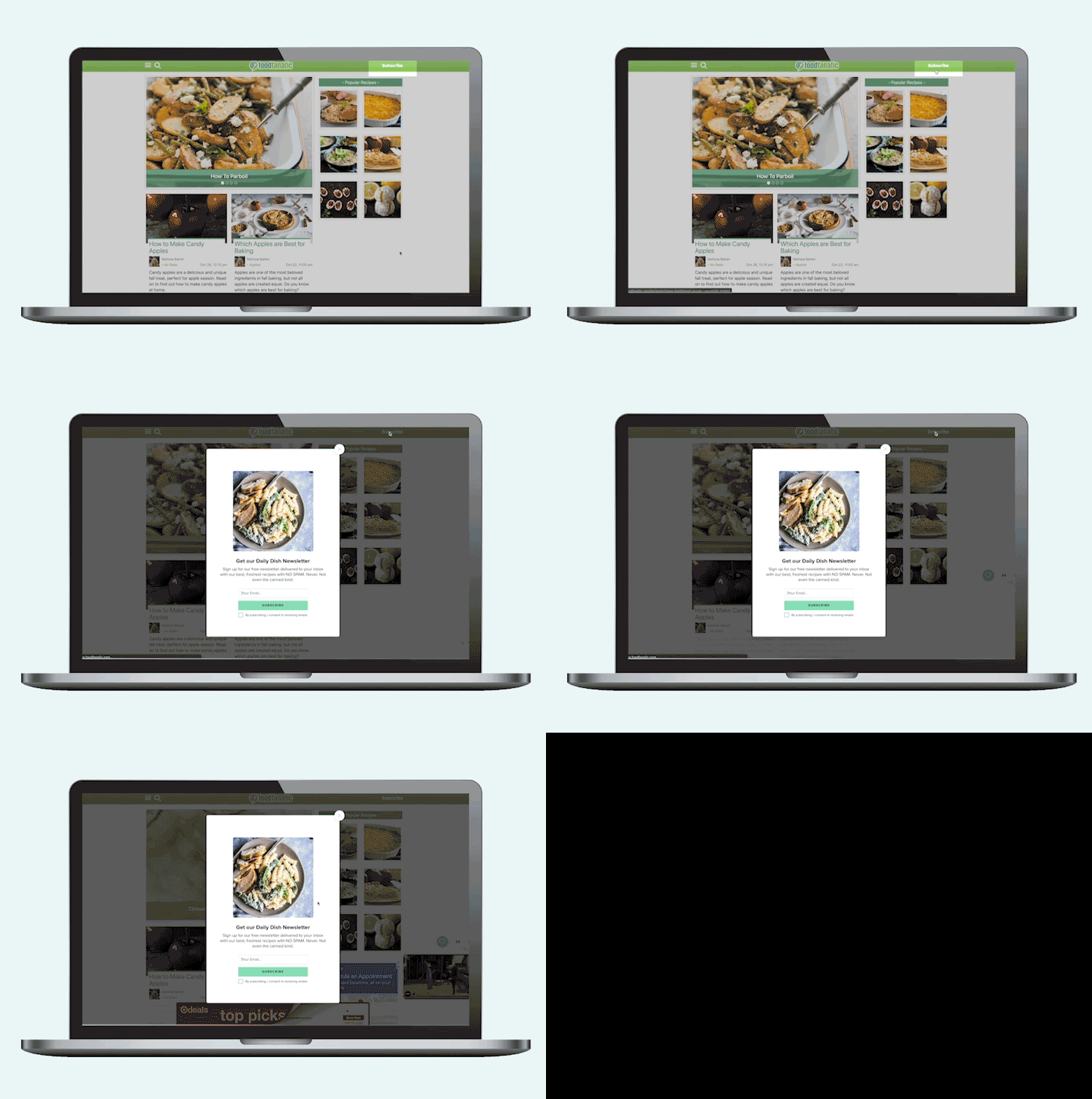
We found it to be a slick user experience, mimicking what a lot of top publishers are doing without the need to send readers to another page.
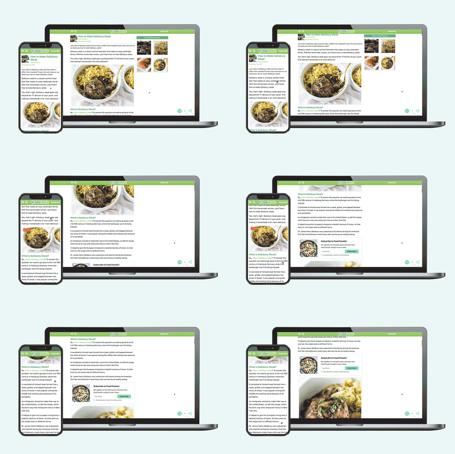
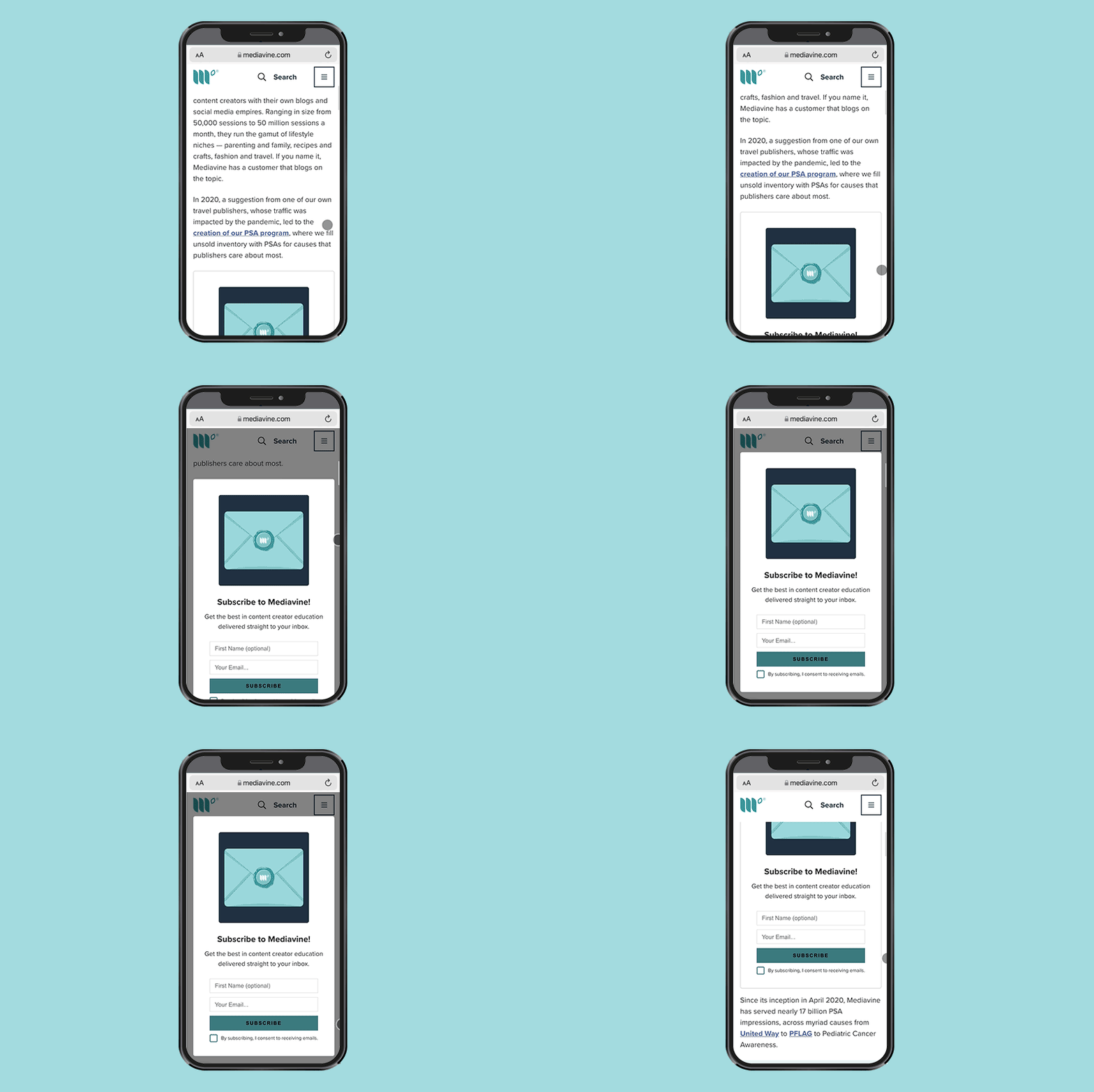
First, let’s go over what our fixed navigation or header looked like in this experiment. We introduced a small toolbar atop Food Fanatic on both desktop and mobile.
The fixed navigation “sticks” with you as you scroll throughout the page.
See GIFs below from our awesome Marketing Graphic Designers to illustrate:

As you can see, we offer the publisher four choices there:
How effective are these options? Let’s look at the data from a few weeks of fixed navigation to see how our users interacted with the various features.
User clicks among 135,885 sessions from October 16-November 8:
Surprising, right?
We would’ve guessed that more than 1.3% of users would interact with the fixed nav overall. We would not have guessed that Subscribe would be the second most popular choice.
Does this mean Subscribe is a wild success? Well, not quite.
Subscribe Conversions
The process of getting people to subscribe doesn’t end with the Subscribe link. They have to give you their email, click the consent checkbox and then click Subscribe.
Therein lies the problem, and a rather steep dropoff; only about 13% (57 of those 414 users) finished subscribing in the end. Why?
We’re pretty sure that the issue isn’t with the Subscribe widget itself, given the success Food Fanatic is seeing on Spotlight Subscribe. In fact, with nearly-identical language and user experience, Spotlight Subscribe outperforms Click to Subscribe by nearly 175%.

How Do We Explain the Drop Off?
My theory on underwhelming Click to Subscribe performance: A lot of readers aren’t getting quite what they expect when they click Subscribe.
Browse around the web and click on Subscribe links in various headers. You’ll quickly see that readers are typically expecting to subscribe to a monthly cost, or maybe even to a physical copy of a particular publication.
For many web users, at least in Food Fanatic’s case, this isn’t offering what they think it is. We’ll be trying out other options in the future as we continue to workshop this.
If you already have a fixed header on your site? Absolutely!
It’s the second-most popular option in our navigation bar, and we saw a nice boost of additional subscribers, meaning it’s still a nice value add, if not a total game changer.
That’s a tougher call.
It’s a significant amount of screen real estate, which didn’t result in as much engagement as we had anticipated or hoped for.
Moreover, there was no noticeable increase in session duration or decrease in bounce rate after adding this additional navigation.
And, as we mentioned earlier, our inline Spotlight Subscribe functionality has outperformed the Click to Subscribe by nearly 175% (80 to 29) so far.
TL;DR — If you have a fixed header, you should do this. If you don’t, it may not be worth it at this point.
But what is undoubtedly worth it for Mediavine publishers? Turning on Grow in your Dashboard and running the Spotlight Subscribe feature. If you’re already sending emails, Spotlight Subscribe is an easy way to boost your subscribers. If you’re not sending emails, use Spotlight Subscribe anyway and start your emails in the new year.
Happy Navigation!
Stay up to date with the latest from Mediavine
In today’s digital landscape, advertisers are becoming increasingly selective about where they place their ads. With the growing importance of brand safety, audience engagement and ROI, the quality of a …
 Eric Hochberger
Since the advent of Trellis, Mediavine’s goal was to provide a WordPress framework to meet the needs and pain points of independent publishers. We’ve had the pleasure of working with …
 Amanda Martin
To enhance both the visual appeal and functionality of our publishers’ websites, Mediavine is making essential updates to optimize ad density while meeting industry standards and maintaining revenue performance. We’re …