Grow Refresh: New Grid View for Search Results and Bookmarks


We’ve been on this Grow journey together for several months now with both the Mediavine team and our publishers/beta testers working to design and develop features ahead of the demise of the third-party cookie.
The Mediavine Engineering team really relies on our beta testers to provide valuable feedback that guide the Grow roadmap. (If you’re not already opted in for Grow beta, it’s available right now in your Mediavine Dashboard!)
If you are already a beta tester, you might find that Grow has a new look (that’s producing some great results!)
After many months with the initial design, today we’re proud to debut a brand-new grid layout as well as share with you a number of other updates and features.
I’m going to give you a rundown of everything Grow currently has to offer, starting with our latest and greatest:
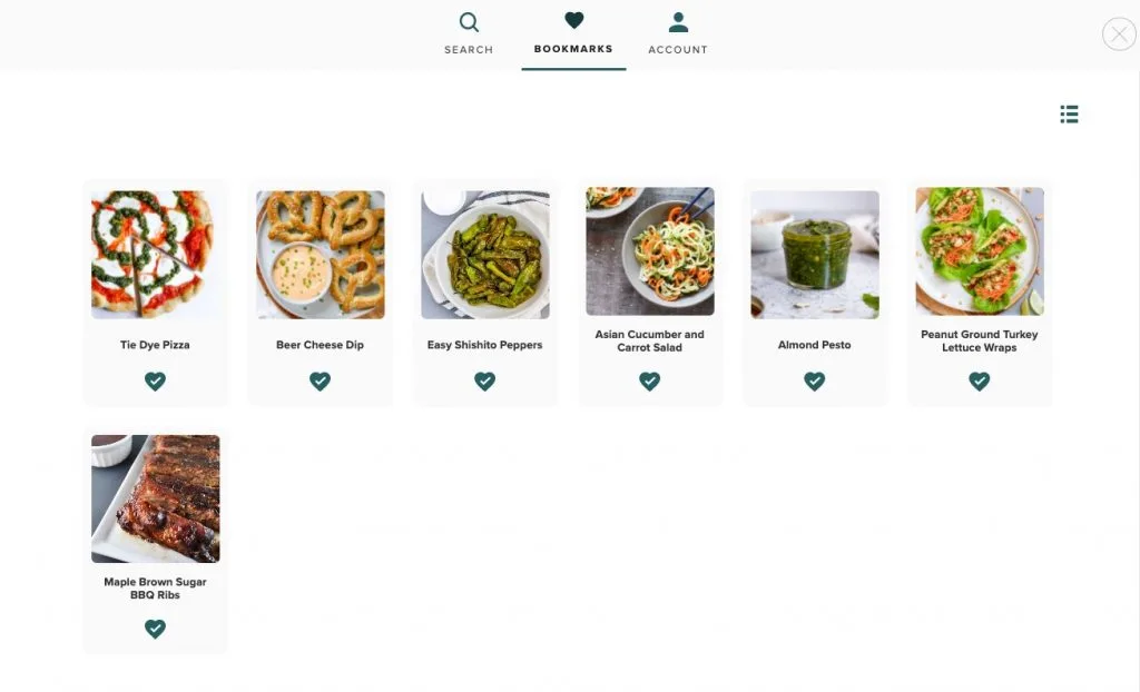
With the latest update to Grow, we added a new grid view as a default option for the bookmarks and search results pages. This new grid view is so beautiful (humble brag) that it is now the default when a reader lands on those UIs.
Users are able to toggle from the grid view to the list view, and it will remember their preference.

We also added a new navigation menu that includes tabs at the top as a header. This allows users to get to their bookmarks or search more quickly. It also allows users to log out via the account tab. This will eventually become an account management page.
With the active tab design, which highlights either bookmarks or search, this menu also makes it more obvious which tab you are on.

With the addition of the new active tabbed menu, we’re able to remove some large words (Bookmarks, Search, Site Name) and unused screen real estate.
We removed the existing header and moved the search bar to be full width and inline. We also kept your site name visible but condensed that space and added it to the inside of the search bar.
These leave more room for your bookmarks, search results and beautiful images to be front and center.
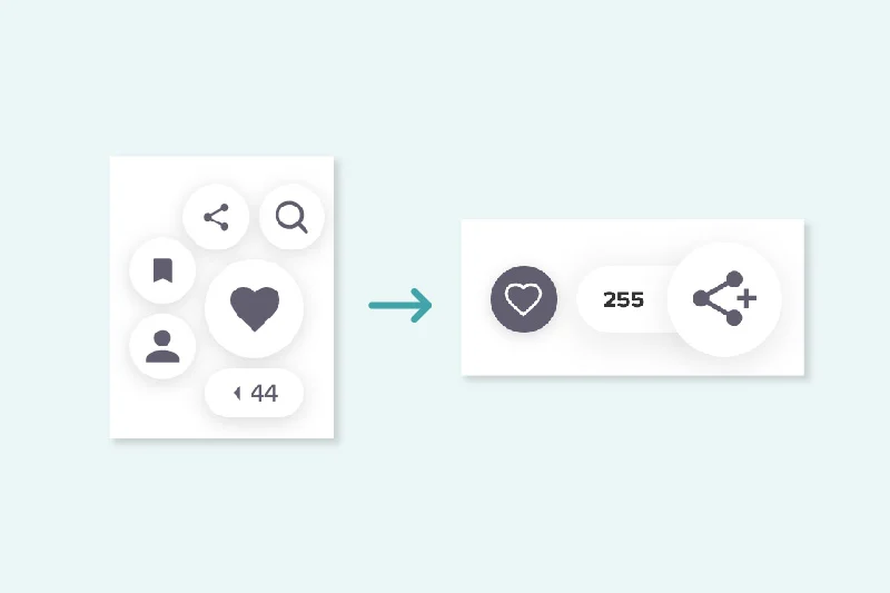
The new widget unveiling from the end of October 2020 continues to boast some impressive data. Not only is the new widget 40% smaller, but it also has 5x more shares, 50% more favorites and 2x more sign-ups.
All of the data aside, it has just two main buttons instead of the previous design which included five buttons clustered together. You can now click to reveal the other Grow features (Bookmarks, Search and social sharing).

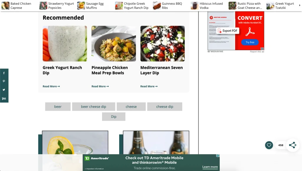
The launch of Recommended Content widgets was a big feature release for Grow, and we know a lot of publishers were really excited to add the three widget placements to their site.
These widgets use machine learning to recommend content for logged in and logged out users. If you haven’t given them a try yet, you still can. Head on over to your Mediavine Dashboard and enable them today!

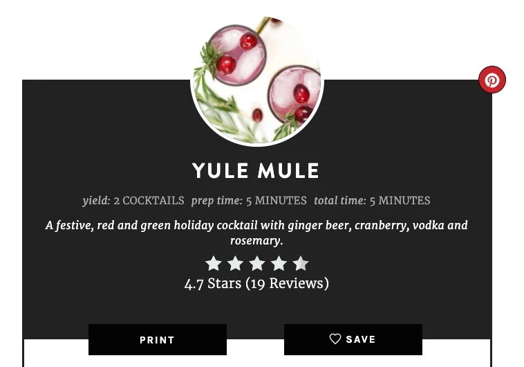
Another big request and a feature we knew would be huge is the save button in Recipe and How to Cards. We knew we wanted to implement this button into Create so we went to work and made it happen.
This button helps encourage readers to save the recipe or how to into their bookmarks which in turn encourages them to sign up. The new save button has a 3x increase in favorites!
We made developer documentation available and WP Recipe Maker now also has the save button available.

We’ve been listening to your feedback, and we’re constantly making necessary adjustments. In addition to these adjustments, we’re running A/B tests to gather data about the best possible performance.
Grow is still very much a work in progress, and the Grow that you see today will likely look vastly different in the coming months, so keep an eye out for future blog posts and updates!
We wouldn’t be able to build this product without your valuable thoughts and feedback.
Stay up to date with the latest from Mediavine
Well hello there friends! It’s been a while but we are back with another amazing feature update. At this point, I think we are past the “get to know you …
This week we’re continuing our never-ending quest to shape the content creation industry one feature at a time through Grow. 💙 But, before I jump in to deliver some exciting …
Hey friends! We’re dropping in to announce two new power-packed enhancements for Grow that will drive further engagement with your audience. If you’re new to the Grow community, you’ve joined …