Grow Widget Unveiling


The Grow widget is getting a makeover, and a pretty big one at that.

In our minds, the data and process behind this change are just as exciting and even more important than the new design, so we thought we’d share with you how it came to be.
As you’ve probably heard us mention recently, Grow is our solution to help publishers build first-party data, well in advance of the looming demise of the third party cookie.
But in order to help you generate first-party data, Grow has to offer something of real value to your audience.
It’s what we call a value exchange with the user — providing them with a better experience on your website in return for them signing up and consenting to personalized ads.
In order to improve the product — and with it, the value exchange — we’re constantly monitoring how users interact with Grow and optimizing those experiences however we can.
Fun fact: Grow uses the very same technology Mediavine uses for our Script Wrapper, with its rapid development processes and impressive A/B testing framework.
Yes, the same technology that powers the industry’s highest-paying ads is used to optimize user experiences with Grow.
With Mediavine technology and publisher feedback combined, Grow is evolving and changing as we speak to become the game-changer we know it will be.
The new widget is one of many updates that your direct feedback and our testing-driven design process have developed.
Alright, enough already. The unveiling:
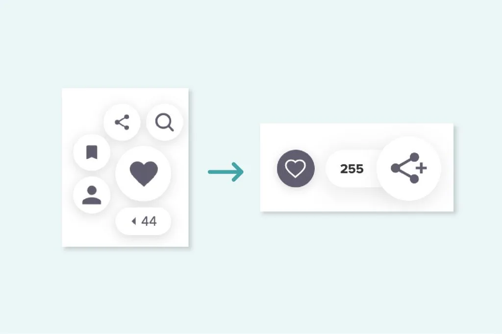
The first thing you’ll notice is that the new Grow widget clearly takes up less vertical height than its predecessor.
Despite larger and easier-to-press buttons, it actually takes up less screen real estate on your website.
This change is the direct result of feedback from Mediavine publishers during our Grow beta. They were concerned by how much space the widget took up, and it’s now 40% smaller, despite a significantly larger, more intuitive button.
The second thing you’ll notice is there are fewer buttons. We previously had what we called the tiger paw or “planet” design, with up to five buttons showing. Now, we’ve pared this down to just two visible buttons.
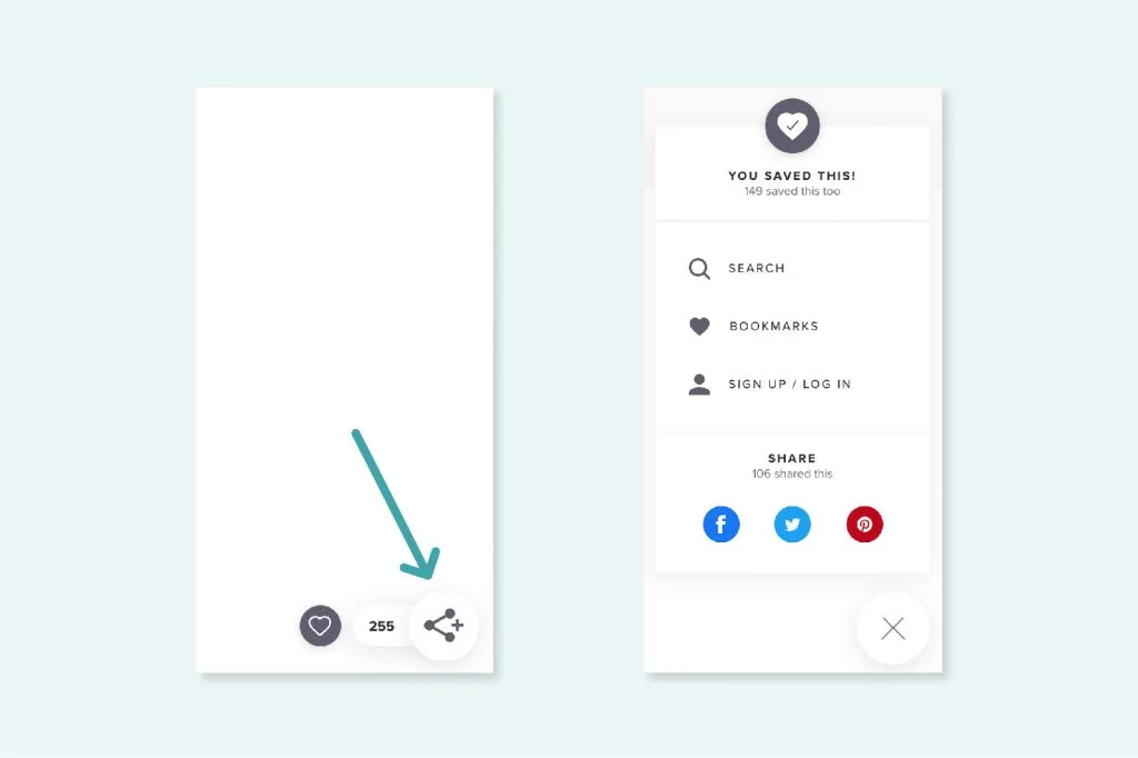
Right now, the two visible buttons are the “favorite” button and a “share plus” icon. The former allows a user to directly favorite a page with one click, while “share plus” opens a menu containing easy-to-access share buttons, as well as the rest of the Grow features, including search, favorites, account management and more to come.
You may be wondering why we picked the favorite and share icons as the new defaults? Glad you asked!
If you couldn’t tell from our intro, we went with these because they were our two most popular buttons from the old setup.
While publishers loved having features like the search button present, and we thought the bookmark icon was important to have front and center, it turns out users felt differently.
They overwhelmingly were using the share and favorite buttons, so those are the two we chose to highlight in our new, more limited space.
Oftentimes, less is more when it comes to user experience.
And guess what? It paid off big time.
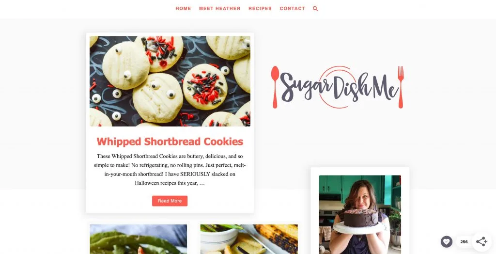
Testing the new widget produced unbelievable results: FIVE times the shares, double the users signing up and a 50% increase in favorites.
Again, all while substantially reducing the space the widget takes up on your website and the screens your readers are viewing it on.

We know this is a frequent request from publishers, but it turns out that not a lot of users were using the search button down by the widget.
Unfortunately, for us to solve the too-many-buttons issue with the previous widget, something had to go. But that’s not the end of search.
Search is still accessible easily from inside the “share plus” menu.
Additionally, soon you’ll be able to add the power of the awesome Grow search to your website by integrating with native search boxes and buttons in other locations on your site.
This new widget is just the first of many improvements based on feedback from our publishers and real-world usage of your readers.
Related Content is coming next, using the same data-driven design. We can’t wait to show you what our Product team has in the works, and how we’ll optimize for conversion.
This new menu-powered widget also paves the way for more features — such as easy ways for readers to follow their favorite sites, browse feeds and so much more — without overwhelming the user.
Oh and of course, opt-in for your newsletters is coming to Grow. We promise that we have not forgotten.
Bottom line, Grow is your relationship with your audience. We’re just here to help you to build the tools to improve it — and create the value exchange that will pay dividends now and in the future.
If you’re already running Grow and providing valuable feedback to grow.me@mediavine.com during our open beta, we thank you.
And if you’ve yet to turn on Grow in your Mediavine Dashboard, what are you waiting for? Help us with the development of this game-changing product and build out your audience of authenticated users ahead of the demise of third-party cookies. Plus, you’ll earn more from your Safari audience today.
Stay up to date with the latest from Mediavine
As the digital advertising landscape evolves, the need for effective data management and compliance has never been more critical. As part of our commitment to providing exceptional solutions for our …
Welcome to the much-anticipated release of the fifth-annual edition of “The Best eCPM Days of the Year” calendar. Each year, we analyze historical trends to provide publishers with a graphical …
“Let’s talk about politics.” We know. This is a phrase absolutely no one wants to hear uttered around the dinner table or backyard barbecue these days. But hear us out. …