Grow Social Pro: How Do I Customize This Plugin


Dec. 6, 2023: This blog post has been updated to reflect the sale of Grow Social and Grow Social Pro to NerdPress. The plugin is now called Hubbub; more information about the sale can be found on our Hubbub landing page.
Social sharing tools have been a must for blogs over the past few years, and our plugin Grow Social has made it simple to have a variety of sharing tools in one easy-to-use plugin.
Grow Social Pro is packed with options that allow you to tailor the social sharing experience to match your site and audience’s needs.
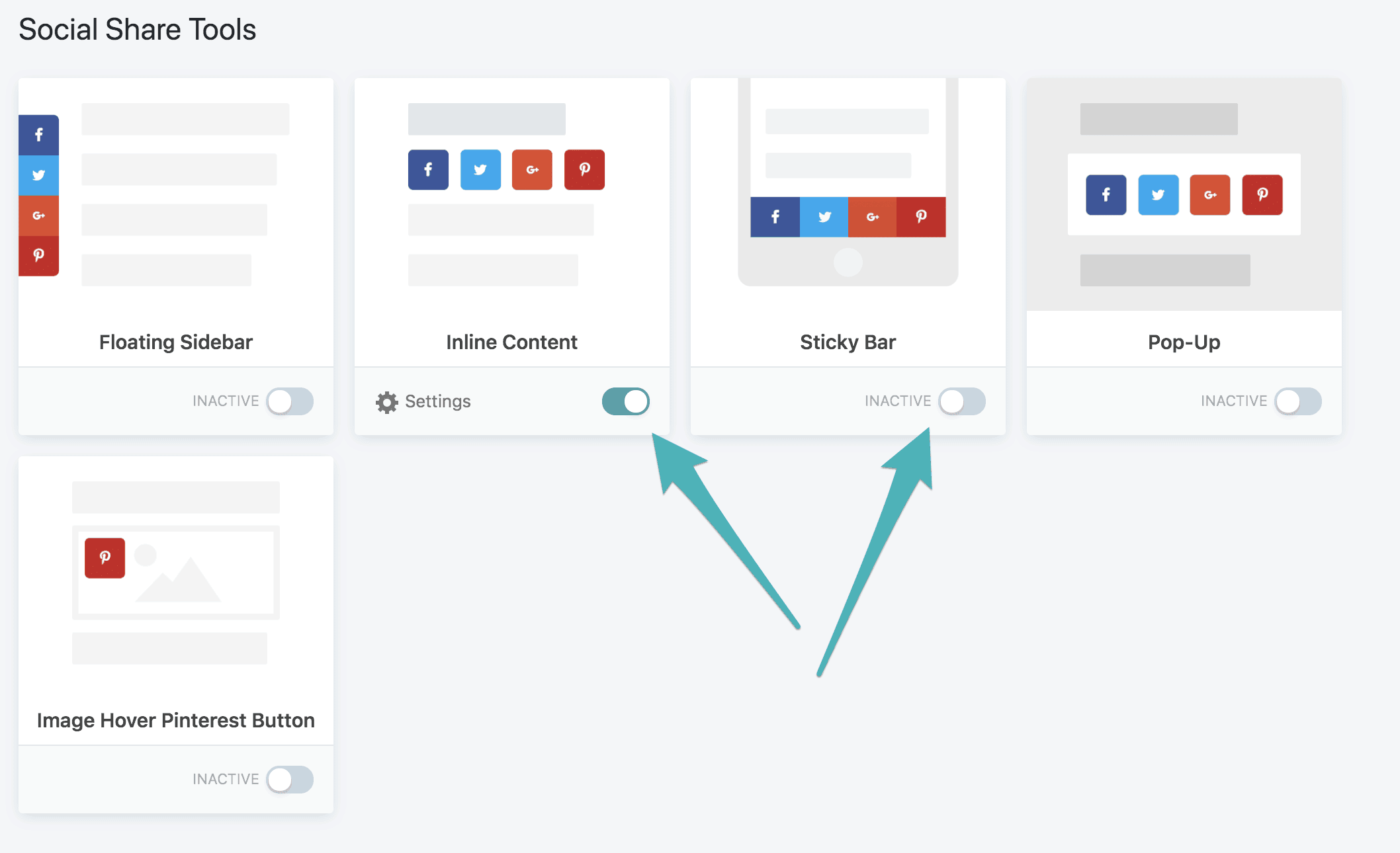
You’ll notice that Grow Social Pro has many more location options over the free version of Grow Social. You can set social buttons in the following locations:
To activate, all you need to do is click the switch where it says INACTIVE. Once active, the location will have settings that you can customize.

Be strategic about your placements, and don’t activate all of them! Look at your site as a user, not as a blogger — or better yet, have a non-blogger friend check it out while you make changes!
You can also use tools like heat maps to determine the best place to put your buttons for your audience. Don’t forget to optimize for mobile first, as most traffic comes from mobile devices rather than desktop.
After you choose which button location(s) you’ll be using, a new menu option for that location will appear in your WordPress sidebar. When you click on that, it will take you to customization settings for the location. You can also get there via the Grow Toolkit screen by clicking on settings for each enabled location.
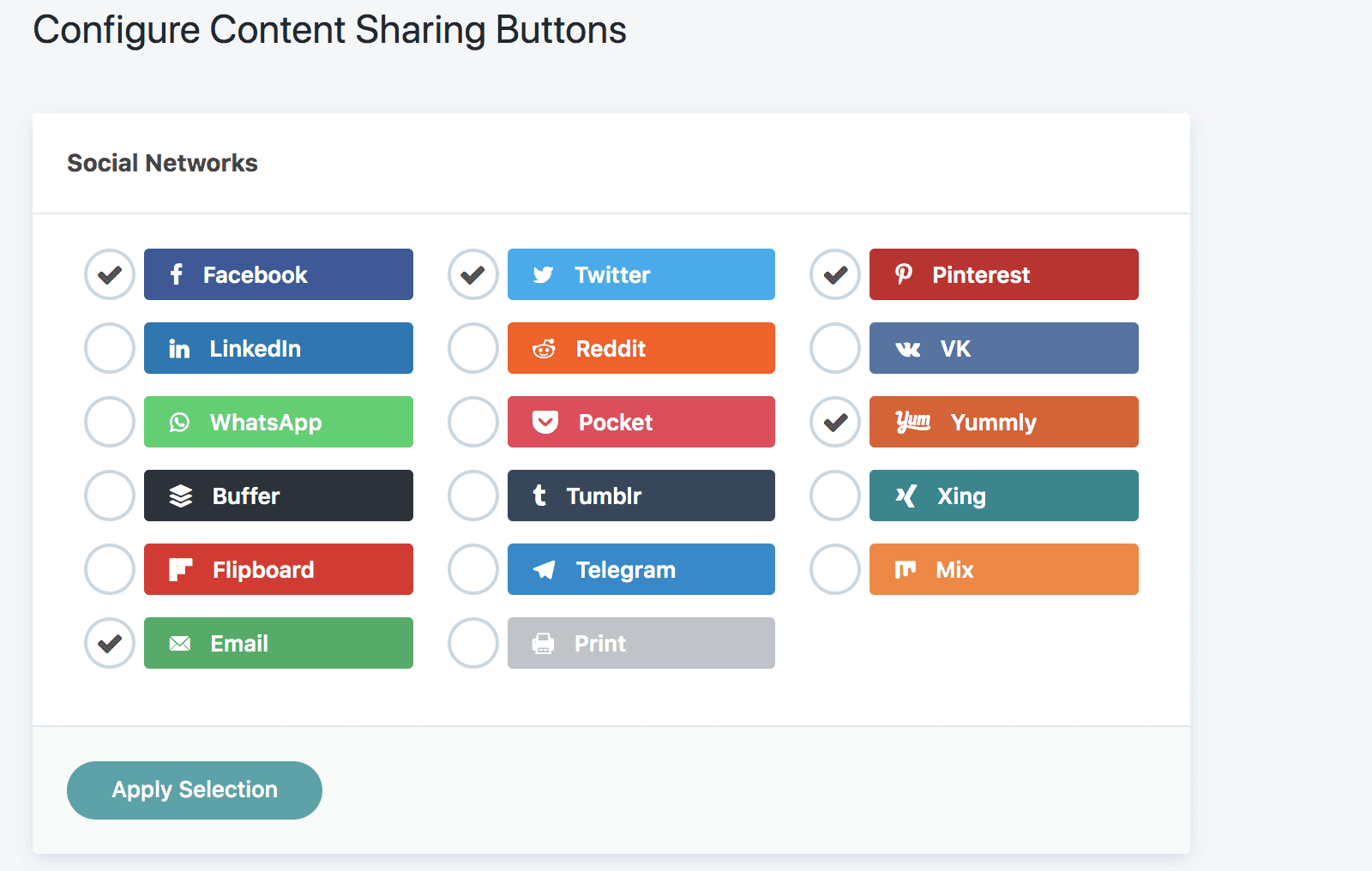
The first thing to do is enable the networks you want shown. There are a variety of networks to choose from, so pick the ones you see the most benefit from.

For most bloggers, this will likely be Facebook and Pinterest, and possibly Mix or Yummly. The Email button is a great option as well, so readers can send posts to themselves or friends.
After selecting the networks, you can choose your button style, shape, position and more. If you like having Call to Action text for your social sharing, this is also where you can add it!
In Grow Social Pro, you can enable social share counts, or keep them off. While share counts were previously important for “social proof,” this tends to no longer be the case as traffic originating from search engines grows.
For both Twitter and Facebook, you’ll need to authorize access to grab social share counts. Twitter uses TwitCount and Facebook requires connecting to the Grow Facebook App, or you can create your own Facebook app.
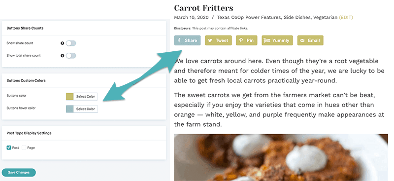
By default, social sharing icons in Grow Social and Grow Social Pro are branded to the platform. That is, Facebook icons are blue, Pinterest icons are red and so on. If you’ve branded your site theme to a certain color scheme, you probably want to change your social sharing icons to match.
Fortunately, this is easy to do in Grow Social Pro.
Once you’re on the settings page, scroll down until you get to Buttons Custom Colors. Here you can either use a hexcode or play around with the color slider to get the options you want. Be sure to keep in mind that color can affect site accessibility.

Tip: If you don’t have the hexcodes for your site colors written down somewhere, please do so! Consistent color schemes are one of the easiest ways to brand your site across platforms.
Don’t forget to hit save, and check how your buttons look on your site. You might even want to try a few different options to achieve the best look.
As of December 6, 2023, Grow Social and Grow Social Pro have been acquired by NerdPress more information about the sale can be found here.
Stay up to date with the latest from Mediavine
Well hello there friends! It’s been a while but we are back with another amazing feature update. At this point, I think we are past the “get to know you …
This week we’re continuing our never-ending quest to shape the content creation industry one feature at a time through Grow. 💙 But, before I jump in to deliver some exciting …
Hey friends! We’re dropping in to announce two new power-packed enhancements for Grow that will drive further engagement with your audience. If you’re new to the Grow community, you’ve joined …