- Advertising
Mediavine’s Standard Ad Units
•
 This subject is ad units — how they’re selected, how they show up on web pages and how we use them to generate the most revenue from every session.
Generally speaking, any Mediavine publisher has the option to run a very similar ad set.
While some ad companies claim to use artificial intelligence to optimize ad positions, Mediavine has opted to give Watson the day off in favor of a simpler approach.
We asked ourselves from the start:
Where are your reader’s eyes when they are on your site? How can we place ads in a way that doesn’t affect page speed, increases its odds of being viewed, and doesn’t disrupt the reader’s experience?
We’ll get to individual breakdowns of each ad unit in a moment, but first, let’s go over what all of these ad units have in common.
All have been extensively tested on Mediavine’s own websites for viewability and performance long before debuting on any of our publishers’ sites.
Some end up as winners and are put into the rotation for the entire community, while others are quickly retired (here’s looking at you, “Read More” unit).
Second, all ad units meet the Better Ads Standards set forth by the Coalition for Better Ads, of which Mediavine is a member. These guidelines and best practices were shaped by actual users after extensive research by the CBA to establish what are acceptable ad experiences.

Adhesion Ad Units
The adhesion ad unit spans the bottom of the page on desktop, mobile, and tablet. This unit sticks with the user as they scroll down the page, making the ads highly viewable. On desktop and tablet devices, this is most commonly a 728×90 unit, meaning the ad is 728 pixels wide and 90 pixels tall. On mobile, this unit is most often 320×50. Further enhancing its 90 percent-plus viewability, we also have the ability to refresh this unit. This means that if a user is on site and engaging with your content for at least 30 seconds, Mediavine can serve them a new ad in that same spot. The longer audiences are engaged with one page, the more ads we can refresh and serve to them. This means users are seeing more ads, and you’re making more revenue, without the need for additional, disruptive ad placements.
Sidebar Ad Units
Mediavine generally runs two units in the sidebar on desktop pages. The first is at or near the top of the sidebar, displaying “above the fold” (ATF), meaning a user does not need to scroll down the page to be served this ad. This “Sidebar ATF” unit can rotate between several different ad sizes. The sibling of the Sidebar ATF unit is the cleverly named “Sidebar BTF” (below the fold), which will always display at the bottom of the sidebar. The Sidebar BTF ad unit can rotate between three different ad sizes and has a “sticky” quality; as the user scrolls down the page, the ad will stick with them. Stickiness results in a substantial increase to the viewability of the unit, making it attractive to publishers and advertisers alike. But wait, there’s more! In addition to the sticky behavior, we also lazy load and refresh this ad in the same way we refresh the aforementioned adhesion units. If you’re lost after any of that, here’s the long and short of it: More ads on fewer pageviews equals more money for less work, plus happier readers. What’s not to love?
Recipe Card
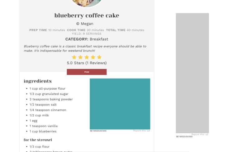
Mediavine was the first to recognize the recipe card as the most valuable content on food sites, and in turn, develop an ad unit for this highly-viewable space. After all, when you follow a link from Pinterest to that amazing seven-layer dip recipe for game day, what are you after? The recipe card of course. Mediavine runs a 300×250 ad unit inside the card and also refreshes this unit when time permits, just like with our sidebar and adhesion units. I’d be remiss if I didn’t include a shameless plug for Mediavine’s own recipe card, Create.
Create goes beyond the recipe card, now giving crafters, DIY’ers, travel writers, and more the ability to include printable cards relevant to their content.
As with any Mediavine product, Create was built with speed and SEO in mind.
Proper Schema.org markup allows search engines to read and recognize many types of content – including recipes and “how-to” items – making a well-functioning content card plugin aimed at helping your site grow.
Our dashboard still refers to this unit as a recipe card unit, but now this ad unit can serve publishers of all niches, if they are using Create.
In-Content
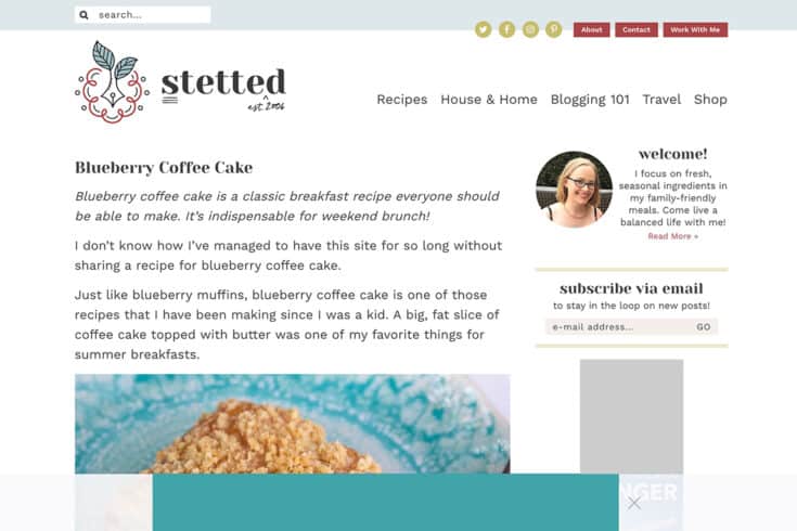
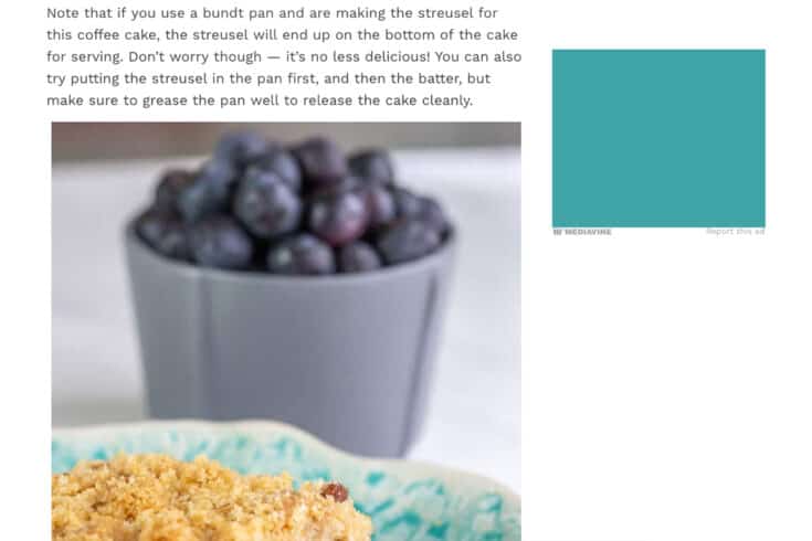
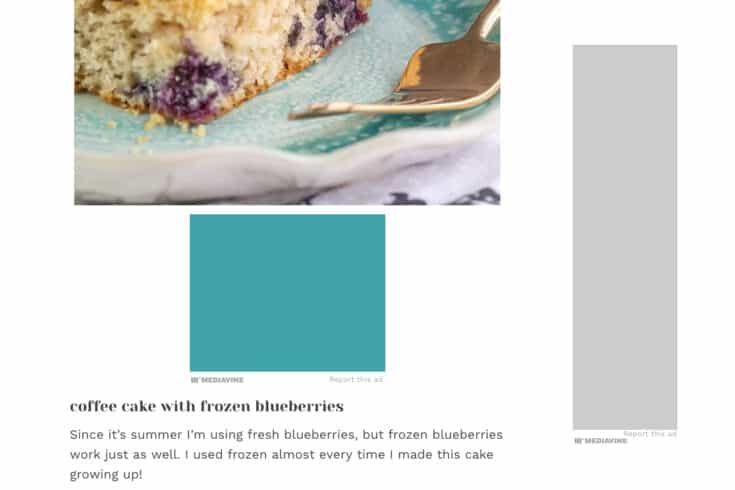
Last but not least is the anchor of Mediavine’s ad unit offering — the unit that sees the most impressions by far and benefits most from our technology. These units run on desktop, mobile, and tablet devices alike, neatly spaced in between the content and images of a post. There is no cap on the number of in-content ads that can be served in any individual article, so long as the content can support it. Our intelligent script wrapper technology spaces them according to ad density settings set by each publisher, ensuring that we never exceed the CBA maximum of 30 percent. With pagespeed in mind, these units are also lazy loaded, creating higher viewability, faster page load times, and overall, the best user experience.About the author
Share this page