- Advertising
Mediavine Video Player: Introducing Our New Design Themes!
•
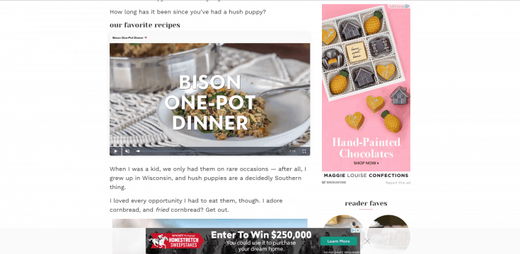
 Now, we’ve brought those design talents to the Mediavine Video Player as well, in the form of two themes that correspond with the new display adhesion designs.
Your choice of light or dark adhesion themes will now match the video player, both as it appears in content and when it “sticks” in the bottom corner as a user scrolls past your video.
 Having a single, cohesive design between the Mediavine video player and adhesion creates a more “native” feel for traditionally non-native units like banner and video ads.
We think they look beautiful, and based on early feedback, most publishers agree.
Another exciting feature we’re debuting today involves the title of the video playing in both the in-content and “stuck,” smaller formats.
We’ll be using the video title you select and the permalink you choose to turn this into a call-to-action that your users can click on.
 For example, if a user watches a recipe from your Up Next playlist while browsing your site, they can now CLICK on the title to be able to get the recipe.
We feel this is a terrific user experience that also optimizes the revenue potential of video, so please, consider using the Mediavine Video Player if you aren’t already.
 Best of all? These new themes are just the beginning. We’re working on individual video controls and other options for themes you choose and customize.
More broadly, we’re working toward video player unification — a massive simplification of Mediavine’s numerous, often complicated video offerings.
Instead of video adhesion, sticky video player and in-content video with tons of different settings, before long it will just be the Mediavine Video Player.
Not only will everything make more sense, it will make your users and advertisers happier. We can’t wait to unveil more in the coming weeks. Stay tuned!
Best of all? These new themes are just the beginning. We’re working on individual video controls and other options for themes you choose and customize.
More broadly, we’re working toward video player unification — a massive simplification of Mediavine’s numerous, often complicated video offerings.
Instead of video adhesion, sticky video player and in-content video with tons of different settings, before long it will just be the Mediavine Video Player.
Not only will everything make more sense, it will make your users and advertisers happier. We can’t wait to unveil more in the coming weeks. Stay tuned!About the author
Share this page